“ht, creating your vision.”
we created a new focussed visual identity for ht, a specialist video, animation and photography agency.
they work in health and social care, the energy & sustainability industry, along with engineering and education sectors.
ht are story-driven, but don’t have a fixed house style. they have flexibly, adapting to ensure their work reflects the clients brand and effectively tells the client’s story. their proactive, inquisitive approach ensures they produce the best solutions.
they’re people-focused; often building long-lasting relationships with their clients throughout the UK.
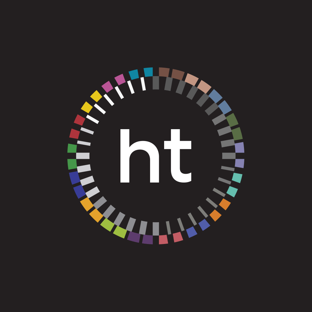
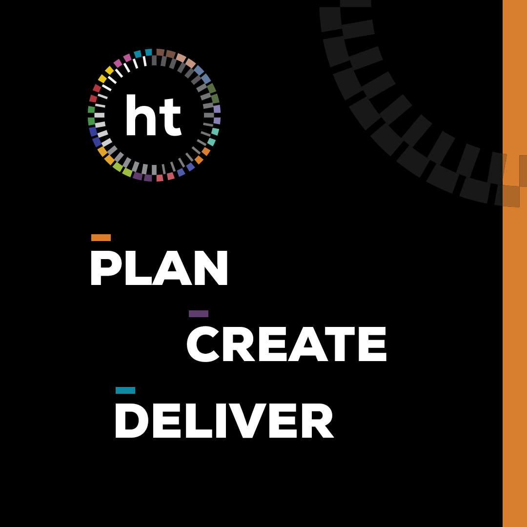
the design of the new logo, was created with the input of the ht team they were keen that it was fresh and timeless while reflecting their brand values. as already mentioned they are people focussed, story led. its never a case of point and shoot they want to capture more with their video work.
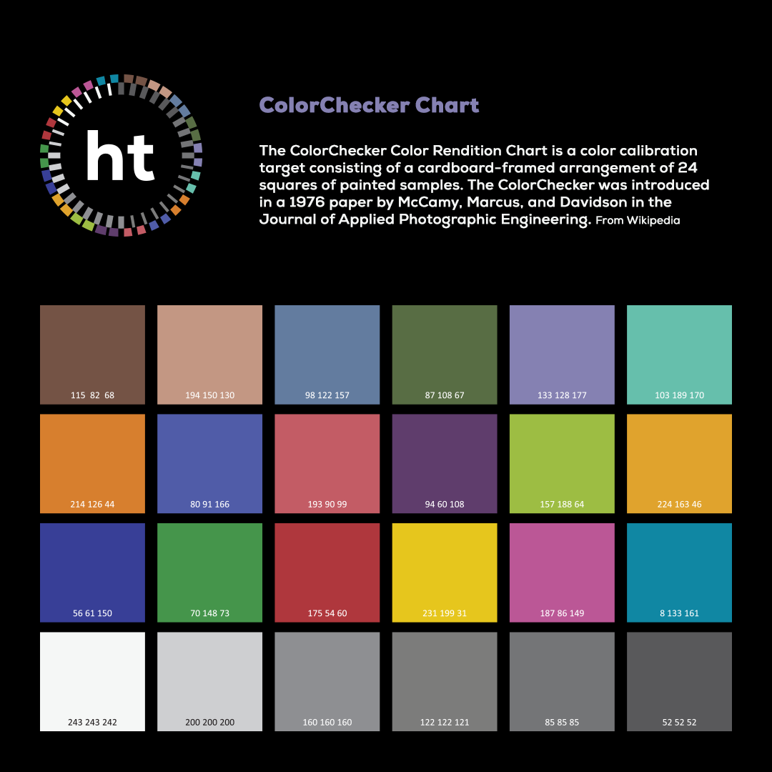
the focus wheel was created using the colours from the industry standard ColorChecker chart, which ht use everyday. it allows us to tailor sections of the website to individual clients or sectors. this helps to keep everything fresh and interesting expanding on the single colour the old branding utilised, although the purple is still featured for a link to to the past and ever important continuity.
they will kill me for the crude gif animation though…