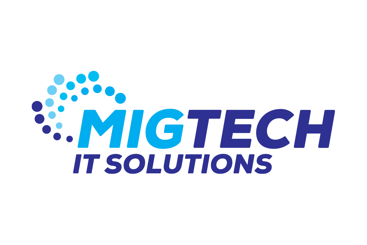
Logo refresh for the lovely team at Migtech
Mick wanted us to re-develop his logo without moving too far from the original.
Our thought process was
– Cleaner font
– Removing blend
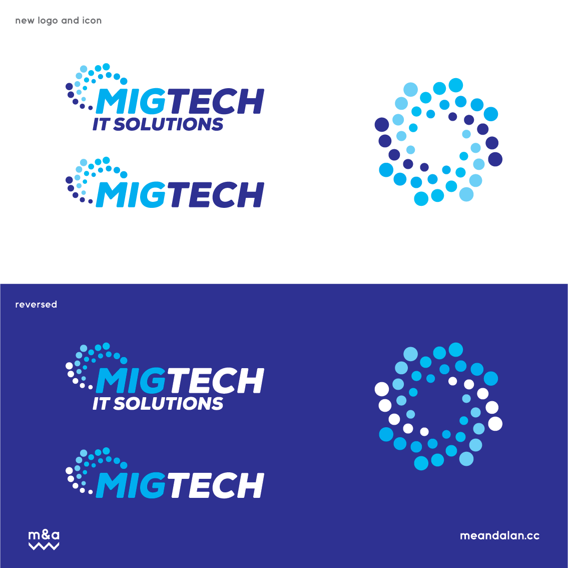
– Creating an icon/favicon
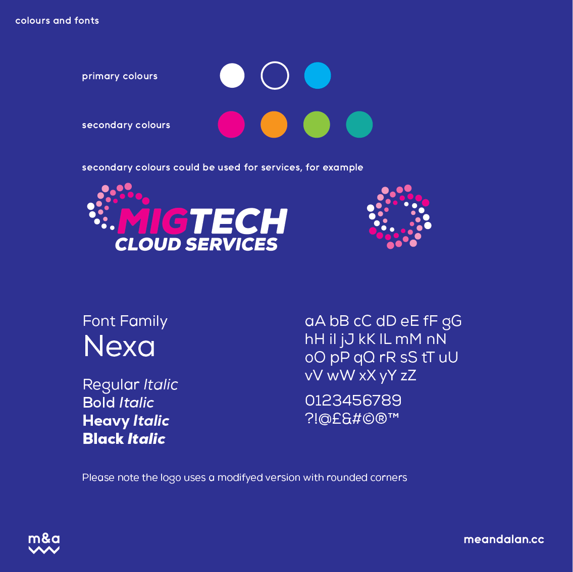
– Complimentary colour scheme to main blue
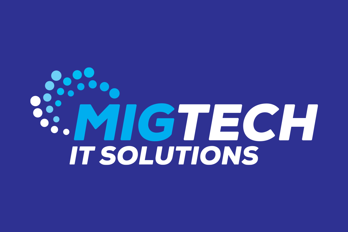
– Reversed out versions

We selected a timeless, clean sans-serif typeface to ensure the brand remains modern and enduring. A versatile colour palette was developed to distinguish between Migtech’s range of services, providing consistence aesthetic.
The icon was thoughtfully designed for flexibility – serving as a favicon, a brand extension, and a graphic element across various applications, including backgrounds. To maximize usability, we also created both a reversed and a transparent version of the logo, ensuring adaptability across digital and print formats.
